

2027 Paint Colour Trends: Fresh Inspiration From Our Canadian Paint Companies
/A New Colour Story for 2027
I always look forward to seeing the Colours of the Year announced each Fall by the major paint companies. I find it so interesting to see which colours are getting attention, what’s the thinking and influence behind these choices, and in general where interior decorating might be heading next. And of course, I take a first quick look to see if the colours are at all similar.
To that point, 2027 announcements have a common thread running through most of them, even though the paint companies have chosen entirely different colours.
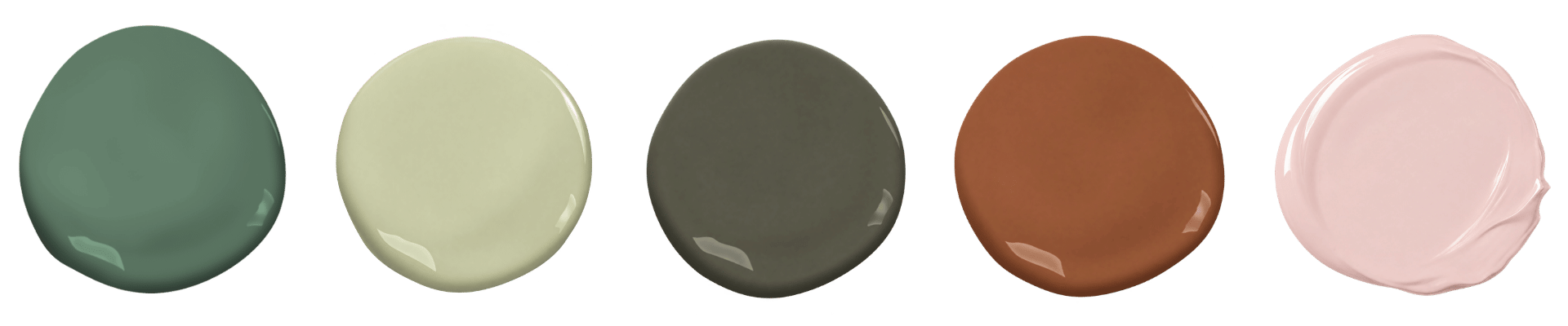
2027 Colours of the year
Nature - Warmth - Comfort - Belonging
We continue to see earthy greens, warm terracottas, gentle blush tones and deeper neutrals. Rich taupes, mushroom browns, earthy olive greys and charcoal neutrals with brown undertones bring personality into our homes without feeling overwhelming.
With the world spinning in so many unsettling ways we continue to grab hold of these tones that make home feel quiet, safe, and where we belong.
Exploring the new colour trends is always fun, but you know I will always remind you that a Colour of the Year might not be the right colour for your home.
Meet the 2027 Colours of the Year
Benjamin Moore: Webster Green HC-130
A classic green with a timeless personality.
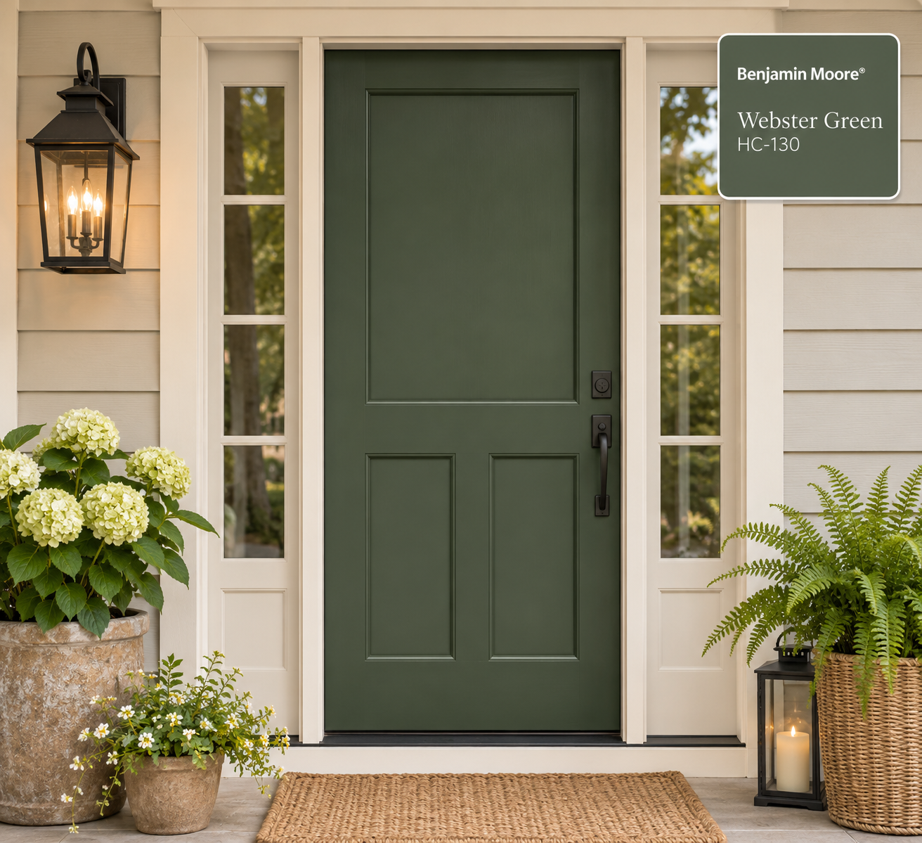
Webster Green HC-130
Webster Green, feels familiar and comforting. A great choice for both contemporary and heritage interiors.
Try Webster Green with warm off-whites, touches of natural wood, antique brass and textured fabrics. This is a great backdrop colour that isn’t too bossy in a room.
Where To Use Webster Green
kitchen cabinets
built in shelves
doors and trim (interior)
front door (exterior) for a nice welcome
Sherwin-Williams: Celery SW 6421
Bring nature indoors with this fresh colour.
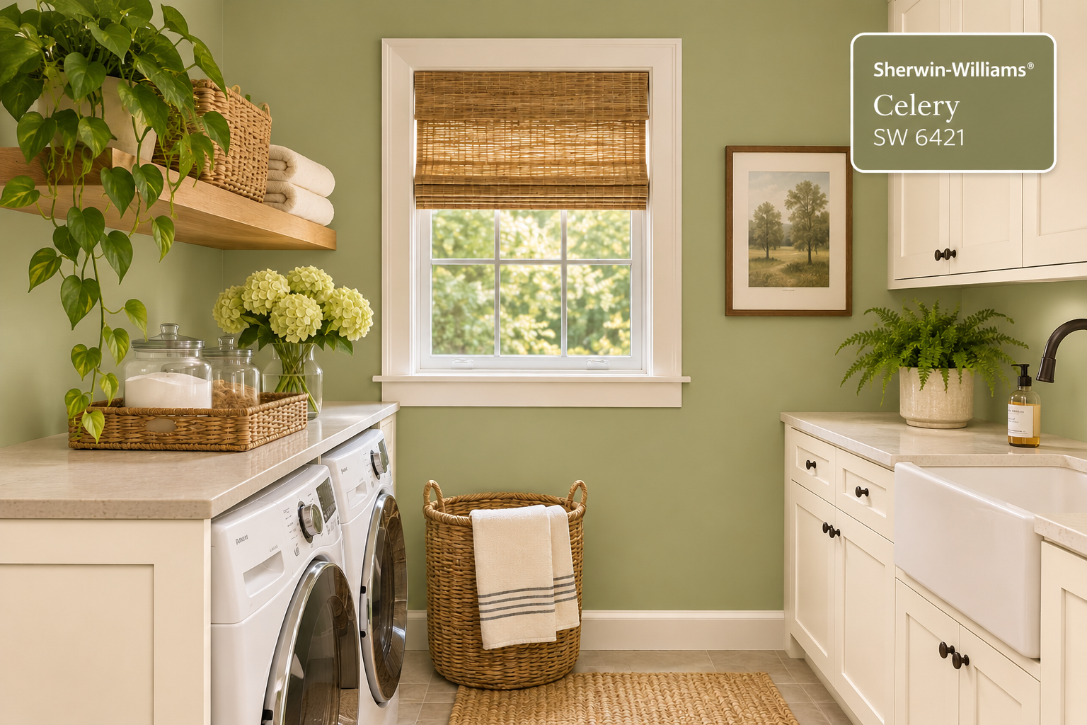
Celery Sw 6421
Sherwin-Williams has selected Celery. Another green that is softer with its yellow-green hue that hints to the botanical feel.
We’ve seen deeper greens the past few years and Celery is a relaxed, cheerful change. It’s fresh yet still adds warmth with the yellow undertone.
Try Celery with warm whites, natural oak, woven baskets and simple, airy linen textiles.
Where To Use Celery
sunroom or breakfast area
casual kitchen
laundry or utility room
bathroom with natural finishes
cheerful accent on furniture
Behr: Grounded T27-01
This deeper green delivers substance and warmth.
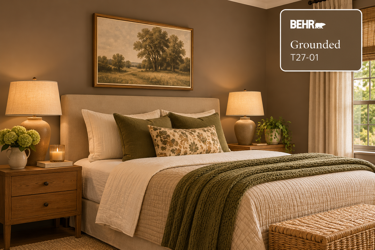
behr grounded T27-01
Behr's 2027 choice is a rich mossy olive with earthy brown undertones.
Grounded feels weighty and comfortable especially when used in a room with natural materials. I’m thinking of warm wood flooring, leather furniture, woven textures complemented with artwork that has specific meaning to you.
Grounded is an example of how a deeper colour can create a sense of comfort and not just a dark room. The important consideration is how much natural and artificial light the space receives.
Where To Use Grounded
kitchen cabinets
den or library
bedroom with warm lighting
feature wall with architectural detail
Sico: Glazed Earth 6066-84
Full of warm, earthy character.
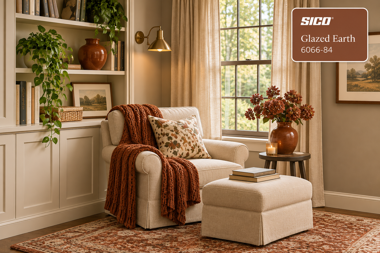
glazed earth 6066-84
Glazed Earth, a warm natural clay terracotta, along with other earthy reds and rust hues can work beautifully with many colours I already see in many homes.
Again, a great choice with nature elements like warm wood furniture, cream toned upholstery pieces, natural stone and muted greens.
My personal style would add this in accessories as opposed to painting entire walls in a room. Introduce pottery pieces, toss cushions, artwork or an area rug for pops of updated colour.
DECORATOR TIP: You don’t always have to commit to a repaint to enjoy a new colour direction.
Dulux: Birthday Cake DLX1059-2
A step away from traditional neutrals this soft blush offers something different.
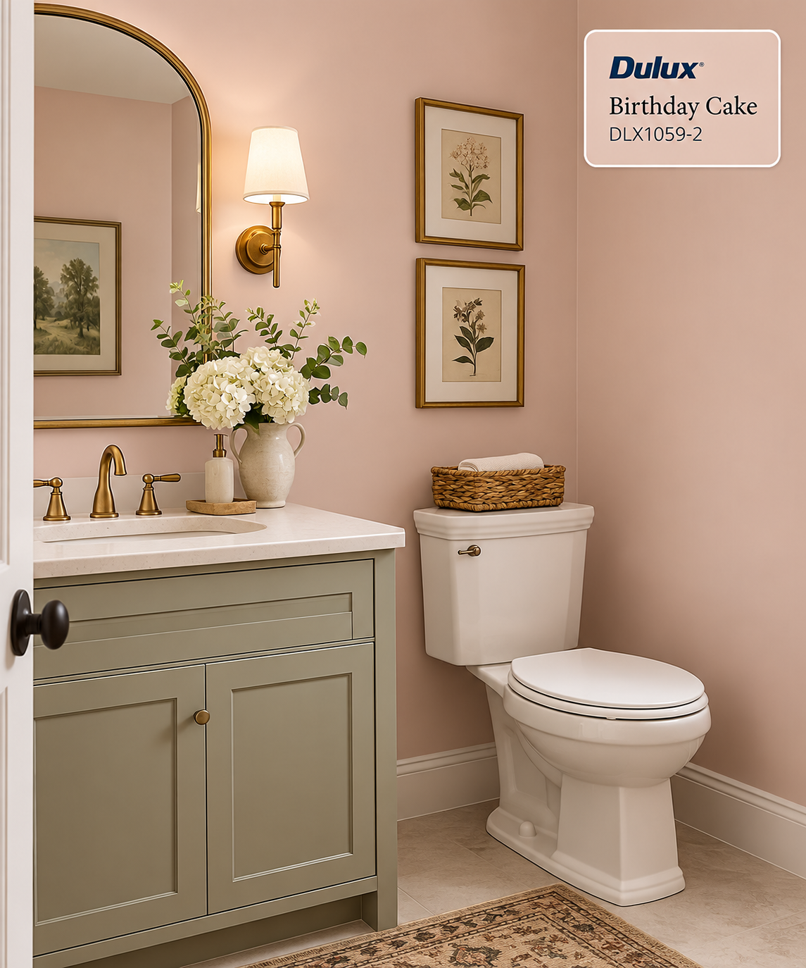
birthday cake dlx 1059-2
Please don’t overlook this softly muted pink with warm, earthy undertones, thinking it’s too feminine. Put this together with natural wood, antique brass, soft whites and deeper contrasting colours and you’ve got a stunning and welcoming space.
Where To Use Birthday Cake
principal or guest bedroom
dressing room
reading nook - my favourite thought
powder room
This might be for you if you’re wanting to step away from beige or grey but aren’t quite ready for a stronger colour.
What the 2027 Colours Have in Common
Although these colours are quite different, they share a softened, earthy quality. From classic and herbal greens to terracotta and muted pink, the direction for 2027 is warm, natural and comforting.
Colour is returning to our homes, but in a quieter and more livable way.
Try Colour Without Repainting the Room
You don’t have to paint every wall to explore a new colour direction. Introduce it through:
a painted piece of furniture
an interior door or bookcase
toss cushions and throws
artwork or an area rug
pottery and accessories
a bathroom vanity or cabinetry
Using a colour in a smaller way lets you live with it before making a bigger commitment.
Before You Choose
Paint colours change with natural light, artificial lighting and everything around them. Flooring, cabinetry, countertops, furniture and adjoining rooms will all influence how a colour appears.
Always test a large sample in the actual room and view it on different walls throughout the day. When renovating, choose fixed finishes first and paint later. It is far easier to find paint that works with your tile, flooring and countertops than the other way around.
Trends Inspire Your Home Decides
Colour trends introduce us to possibilities, but a Colour of the Year is not automatically the right colour for your home.
The best choice is one that works with your light, existing finishes and furnishings—and creates the feeling you want your home to have.
Which of the 2027 Colours of the Year would you consider using?
If selecting paint colours leaves you second-guessing every sample, a professional Colour Consultation can help you create a connected palette that works specifically for your home.


