

Benjamin Moore's 2026 Colour of the Year - Silhouette
/The Story Behind Benjamin Moore’s 2026 Colour of the Year
Out of over 3500 colours, Benjamin Moore just dropped the news that Silhouette AF-655 is their choice of colour for 2026 with a prediction of seeing it as a design choice for years to come.
This moody, deep brown is not just another shade of brown. Benjamin Moore describes this rich, warm espresso as a classic, a refined neutral with depths of charcoal.
Silhouette AF655
RICH MOODY CLASSIC
Why Silhouette? What Makes It the Pick
I always like to research the how and why a colour is chosen. Here’s what I found out:
our desire for security in THIS troubled world
World events always drive design decisions, whether in fashion, the marketplace and definitely in interior design and decor choices. Stepping away from micro-trends that come and go so quickly, Benjamin Moore’s Silhouette offers a peaceful feeling of depth, classic longevity, and brings a sense of calm. It’s a beautiful, bold and moody choice.
brown neutral paint colour comeback
We’ve seen such a strong nature inspired shift in our design colours over the past several years. Earthy tones like this deep brown are here to stay. This trend continues to help us find that sense of wellness and build our home-based sanctuary. Very important foundational elements to think about to keep us feeling grounded while adding that sense of stability we all need right now.
Silhouette is a great blend that takes the edge off of a harsh true black with it’s espresso and charcoal undertones. A beautiful deep brown that will definitely become an important “new neutral” to bring some personality to any palette .
fashion influences interior paint colours
New hues from colour forecasting experts always influence the fashion industry and the marketplace in general. Benjamin Moore’s colour of the year is no exception, taking inspiration from suiting fabrics that are “handsome”, with a keen attention to detail and refinement.
Interior design and decor shares the same attention to detail when putting a space together. Key elements in particular for a timeless, classic style. Let’s “wear” some colour in our interiors!
Light Reflective Value of Silhouette AF655
LVR tells us how much light a colour reflects and ranges from 0% for black to 100% for white. Silhouette comes in at 10.18, definitely a dark hue that makes a statement and one that mixes with lighter hues because of it’s softness.
Light always plays such an important role in how a paint colour looks in a space. In certain light you’ll see more of the charcoal tones, while in others the warmer brown. This changing quality is the very thing that adapts it to different types of rooms and a variety of colours to create beautifully curated palettes.
Where & How to Use Silhouette
create a stunning accent or feature wall
balance it with lighter walls around it for balance
colour drench a home theatre or cozy office for moody drama
trim, moldings, built-ins, cabinetry - custom shelves and bookcases
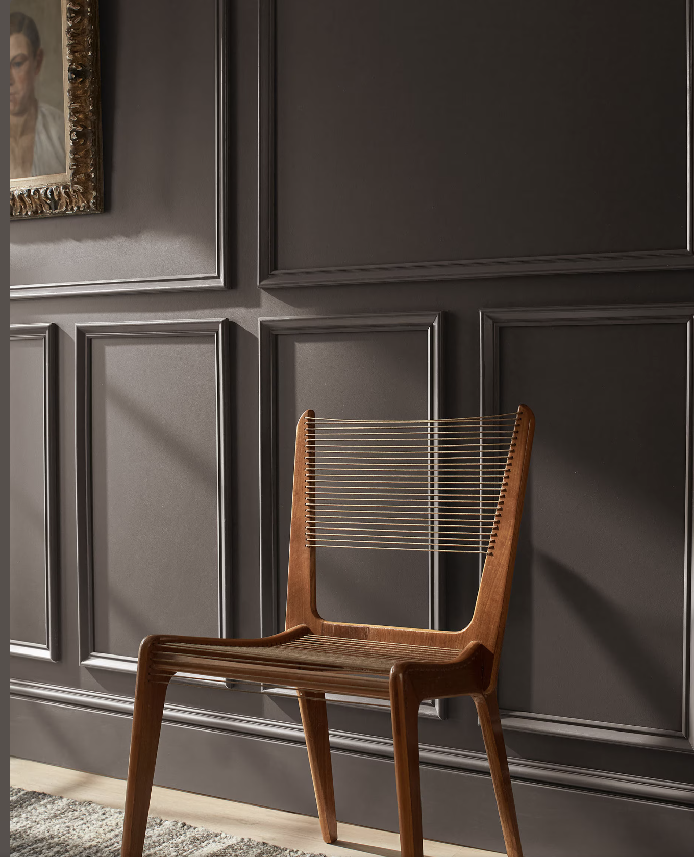
beautiful choice for wainscoting to add weight and richness
front doors, entryways and foyers for a sophisticated welcome
powder room and small spaces on all walls for big impact - keep the ceiling light to avoid a cave effect
create statement furniture pieces of accent pieces, sideboards, media units

Decor Tips With Silhouette
keep the richness by pairing with wood, brass and gold metals
always test a colour in the actual room - undertones shift in both artificial and daylight
give it some lift by pairing with metallics or lighter colours
pair with beige, blush or brass for a warm look and feel
try with charcoal for dark on dark
with emerald for all the drama
Complementary Colours & Palette Suggestion
Here’s my curated palette for Benjamin Moore’s colour of the year 2026 Silhouette AF-655. This colour is a winner in my opinion. Sure to deliver that “wow” factor and when used the right way, will deliver an exceptional end result.

Hire me for your next design project. I’ll help you
choose the perfect colours for your space!


