

Trending Paint Colours 2025 Check In
/Here we are nearing the end of May and I thought it would be the perfect time to relook at decor trending paint colours 2025 is offering. It’s right around now that clients are reaching out for Colour and Design Consultations for projects they’ve been dreaming of over the winter and maybe longer.
The spring weather seems to awaken new energy in us to refresh our surroundings, maybe organize the linen closet, and for many it’s the perfect time to get some painting done. And why not? Change is good for the soul.
SPRING DECOR REFRESH
Thinking of refreshing your space and wondering what colours to use? Getting the paint colour right is key. Contact me for a Colour Consultation anytime.
We instinctively start by looking at what colours are trending so that our redecorating is updated and will hold it’s own for another 5 - 7 years. That’s about how long a paint decor trend lasts.
Please note that while using these trends as a guide can be a smart part of your process, it should never be your entire process. Not all of the trending colours are the ones for you. You still need to pick colours that work in YOUR particular space to complement the undertones of your fixed elements and your design style.
I know, I talk about that a lot, but it’s because it’s the right way to approach it. Looking at your flooring, countertops, fireplace facing, tiles, and any other architectural details that are foundational pieces you are not changing, all drive what colours work best in your space.
Then we can add variations of the trending colour tones to go with what you’ve already got going on. This works for furnishing, smaller decor items, accessories and then of course, those fun extras we like to add for interest, and because we love them.
PANTONE COLOUR OF THE YEAR 2025
Pantone always sets the compass for the direction colours are going globally. In my industry we all watch for their December predictions and choices to see what the upcoming years shift in culture, and of course, in trends will be. Pantone works hard to predict colour that expresses a world attitude and mood, and this year it’s all about connection, comfort and harmony. In our troubled world right now, I think Pantone is on to something good here.

This year Pantone’s Colour of The Year 2025 is
MOCHA MOUSSE
17-1230 TCX
DOESN’T THAT JUST SOUND YUMMY?
Thinking of chocolate and coffee are very comforting, and the rich, creaming qualities of mousse are something I can connect to in a moment. This colour would create a very serene, cozy interior space.
It speaks of a bit of indulgence, something rather lush, sophisticated and quieting all at the same time. I feel pretty content after a nice bowl of luscious chocolate mousse. How about you?
Pantone colour influences everything from fashion, jewellery, automobiles, household and technology items, furnishings, and of course paint colours.
Where To Use Mocha Mousse & Trending Browns
as a wall colour to make your room feel warm and luxurious
as cushions, throws, area rugs, and window treatments to add interest and texture
an upholstered bed frame, or maybe an arm chair or sofa would all say sophisticated
add textile accents against the beautiful classic warm whites for a modern yet timeless look
Biophillic Design Earth Tones Are Still In
Natures colours are still going strong in 2025 as we continue to embrace natural elements in our homes. We’re seeing terracotta, olive, emerald and sage greens, clay tones of brown, dusty rose, plums and burgundy, as well as rich blues. I hear chartreuse is a big one to watch for, too.

2025 colours
We seem to be craving the colours of nature indoors to calm us and help us feel a little more grounded I think. Again, this crazy world of chaos means our homes should be our sanctuaries more than ever before.
Where To Use An Earth Tone Colour Palette For Home Decor
Cozy up your living room with any of these tones
A touch of green is one of my favourites and looks lovely and warm in a kitchen
And that all important first impression and welcoming of guests in your entryway could be lovely in a soft dusty rose or dramatic in burgundy
Deep or soft browns, subtle greens and blues look great anywhere
Neutrals That Never Change
You can create a very beautiful room by paring these suggested earthy colours with soft neutral creams, warm whites, matte black decor and furnishings.
Neutrals really never go out of style, especially in timeless decor. The warmer ones are right at the top of the list for colour choices in 2025. They help create a clean, open feel and give you the versatility to easily change up your decor by simply switching out your artwork or throw pillows for an entirely new look.
The more popular shades are warm beige, soft taupe, any of the creamy whites, and the mix of grey and beige we call Greige. These colours bring a sense of ease to a space and are the perfect backdrop for adding the bolder accent colours for a really pulled together decorated space.
when to use neutrals
On walls in any or all rooms to make spaces look bigger, feel light and airy
To connect spaces, neutral hallways create flow between rooms
To bring a clean, fresh look to ceilings and trims
What Colours Go With Neutrals?
A neutral base colour lets you play with colour in both fun and more subtle ways. Try these colour pairings with your neutral backdrop using lamps, curtains, vases, artwork, accent walls or maybe some fun furniture.

beautifully designed space using earth tones
Soft blues or sage green with warm beige for that calming, earthy feel
Muted mustard yellow with creamy white for a pop of fun that’s not too bright
Blush pink or terracotta with taupe creates soft romance that’s warm and cozy
All of these trending paint colours 2025 is offering would express your personality and create harmony in your rooms. That’s the best way to create your own unique sanctuary - one that feels like you.
Current Project Palette
Here’s a look at a curated colour palette for one of my current projects. You can see these earthy hues will satisfy the design brief for a warm, cozy feel against a soft, warm white backdrop. Be watching for more about this one.
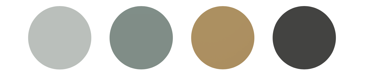
curated palette by jill carty designs


